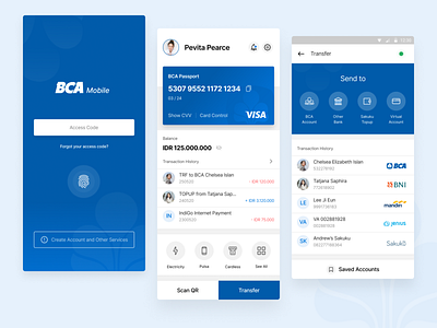
BCA Mobile Banking Redesign Concept
BCA is one of the leading bank in Indonesia.
The concept is simplifying the recent user interface and experience of BCA Mobile Banking application.
In the login screen, I remove the other menu besides Mobile Banking because the others just redirects to website url, and not significant.
The homescreen put all the important menu only, such as showing Card Information, Total Balance, Latest Transaction, and Favorites Payment menu.
There are two fixed button on the bottom, I put these buttons as distinct as it is, so user can easily find the main feature of the app, which is Transfer.
The transfer page also redesigned to the simplest one, and easier way to find the recent transactions.
This redesign concept is personal and not affiliated with BCA Bank.
Contact me: bily.muhamad.fachri@gmail.com
