Dailylogochallenge #09
Hello everyone👋
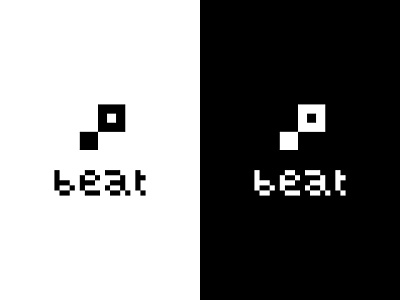
Beat is a music startup with a simple and minimalistic logo that is very descriptive. Beat is a rhythmic unit in music and because of that reason it's designed using single square pixels. The word beat sounds like to word bit which is the smallest unit of data in a computer and that helps picturing the logo as something basic and elemental as a whole.
Watch the process in YouTube
https://www.youtube.com/watch?v=cbK9Z9pK35k
Hope you like it!🙏
More by Miquel Parera - simplified complexity View profile
Like
