HelvetiPaper Redux
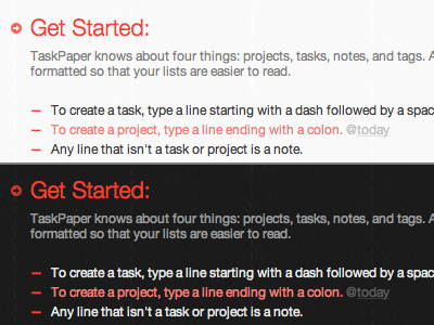
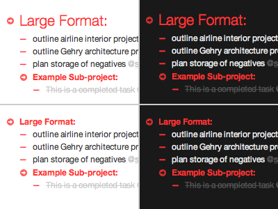
You got it, Dan. For highlighting prioritized tasks, this paler hue of the red-orange header does the trick for me in both instances. I also added just a touch of transparency to both backgrounds—95% opaque for the dark grey, 98% for the white. What's your thought on this?
More by Michael Bester View profile
Like

