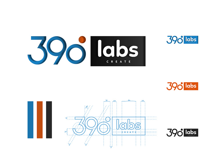
390labs Logo design
I remember joining 390Labs early this year and my first task was in creating a revamp of its company logo. I immediately went into full Sage mode and created different grid structures as well as experimented with different ideologies. I figured it would be best to represent their logo with a wordmark and decided to embrace the culture and ideology behind the degree - 390. Hence rotating the orange accent on the crown of the Number 0 to an angle of 30 degrees created a whole value of 360 + 30.
I enjoyed working on this project and just thought to share.
Thoughts, critique, and comments are much welcome :)
More by Mayowa Ogundeji View profile
Like
