#Daily UI 100 Day Challenge: Day 5
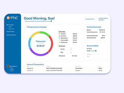
This UI challenge involves creating an analytics chart. I decided to re-design and simplify PNC’s user profile. In my opinion, the current platform is rather out-dated and in need of a facelift.
I removed all the gradients and bold headers. I expanded the width of the screen to maximize the use of white space. The original felt extremely cramped. Now, I believe it uses white space properly and by simplifying the platform it gives the profile a new life. One that would hopefully be greatly enjoyed by current and future PNC clients.
A comparison with the original website can be found here: https://creativenoodles.me/daily-ui-100#/daily-ui-5/
