Color Palette Progression

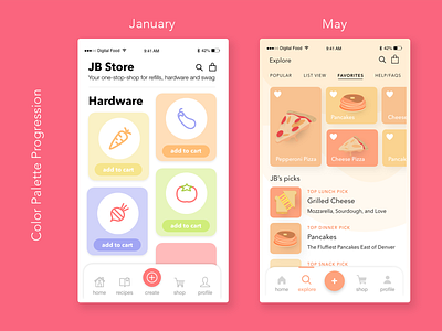
Designing a consumer-facing app for 3D-printing food, our initial goal was to create a sense of playfulness and minimalism. Our thought was that it should be just as easy for a 70-year-old user to understand as it is for a 13-year-old user.
Ultimately we transitioned from a pastel color palette to a combination of more muted, erathy tones.