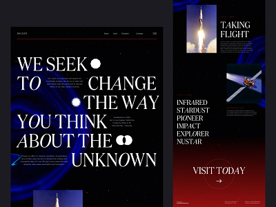
Galileo Space Institute Landing Page - Concept
Some more exploration for UI. This one took a turn towards outer space - partially born out of a desire to make some cool textures for the background (which, weirdly enough, started out as images of nail polish). I also wanted to be a bit more experimental in terms of typography and color.
On a side note, there's so many talented designers on Dribbble 🤯 I get inspiration from so much of the community here. At the same time, I'm always wondering how people manage to pump out new designs so frequently, or if I'm just a slow designer 😂 Anyways, hope you enjoy this very space-y design. Had fun going through the NASA image gallery for photos.
P.S. Did you all see the recently released UFO videos from the Pentagon? 👽
Space Landing Page - Lucy Bi.jpg
900 KB
More by Lucy Bi View profile
Like


