Bloomfire for Web
And the last one for the night. Didn't mean to flood everyone's feed. You can kick me in the shins if it makes you feel better.
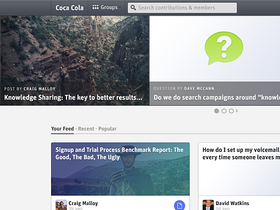
We are just finishing a major redesign here at Bloomfire for our dashboard/homepage. We've been rethinking the way people want to share, and view things in their organizations so we've cut back significantly on the space navigation elements take up, and tried to prioritize what people really want. Relevant, new content from their coworkers.
We've also broken down artificial hierarchy that develops over having specific sections for certain types of content. Everything is now equalized in one central feed.
Check out the comparison between old, and new.
More by Jayden Anderson View profile
Like


