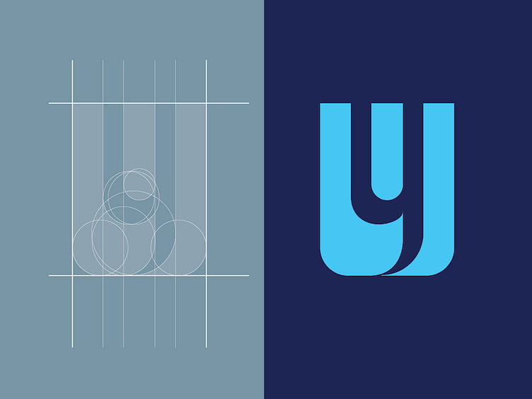
yWorld Logo Mark
Design of the yWorld logo mark. I've used negative space to have a "y" inside of the "w". Being a collaborative platform for professionals, the colours and logo should give off a professional, corporate and modern vibe.
More by Johanne Chow View profile
Like
