Re-Dedign House Renting Website
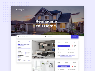
Redesigned landing page for house renting website.
I kept the UI Simple and clean, easy to find most used filters with just one click, Used only one primary color and white as base. Main focus was to give the user a better user experience with less cluttered UI.
Leave a comment below or hit the like :P
More by saurab sen View profile
Like
