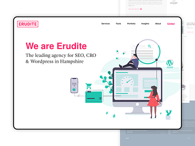
SEO Agency Homepage Concept 2 - Desktop
The agency I am Creative Director at are undergoing a re-brand right now - new logo, website, colours, typography - the lot.
Here's the next concept (after the logo had been agreed). In this one I've used a much 'squarer' approach to the different cards and panels. The design as a whole uses much more white space and a flatter illustration style which works well with the font pairing of Nimbus and Gandhi.
What do you think?
Checkout my Instagram to connect and see what I'm up to, day to day!
Thanks all
Richard
More by Richard Jarvis View profile
Like


