Product Design at albo
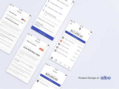
While workin at albo I got the opportunity to design key features.
Card Tracking
We wanted to provide certainty to the user about the process of receiving their card and activating it.
In the following shots I'll show some wire frames and the process of this project.
Money In V2
The challenge was to improve the experience of our users to add funds to their accounts. I had to review how they walkthrough this task. After that, I did some information architecture, in order to identify and prioritize the information given to them in order to add funds to their accounts
Spaces
With Spaces we were aiming to provide our users a way to have more control of their money. We found interesting insights about how people see money. “If I don’t see it, I won’t expend it”. I had so much fun working with the team through the discovery processes.
Thanks for everything albo 💙


