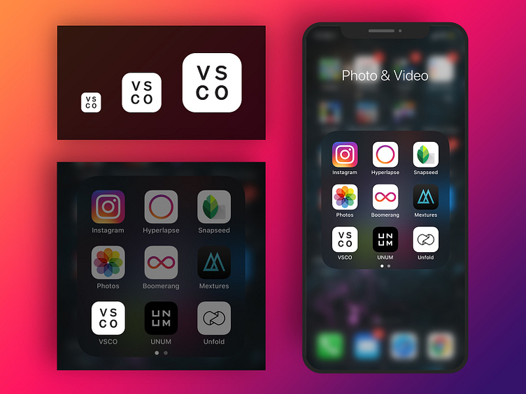
VSCO App Icon Redesign
One of my most frequently used apps is VSCO. I organize my apps into groups on my phone by category, since I have SO many (as I imagine many other designers do). Despite using this one more than all my other photography apps it seems weirdly elusive, as if I have to look for it every time. I used their signature letters (and maybe a throwback to old versions of this icon/logo) to create an icon that stands out yet also sits nicely within my photography group shown at the sizes necessary for iPhone use cases.
This was a quick, fun project for me and by no means shooting down VSCO's logo/app icon.
More by Heather View profile
Like
