Dashboard [wip]
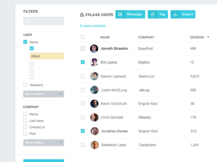
Trying to clean up some spacing / grid. Organize things more together, kill some space and high up the density of informations. Also playing with some styling for buttons and other elements to create some pattern library.
Anyone can notice those 2px light drop down shadows on buttons (and same effect for inner shadows on inputs)?
More by Frantisek Kusovsky View profile
Like
