Furn
1 Hour Logo Challenge #14 Furn
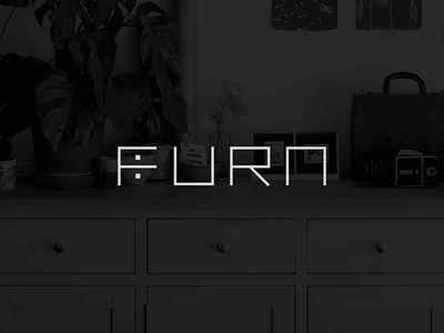
Think of Furn as IKEA, specialising in furniture and household items – but online 🛋
Getting feedback from Hitesh himself, he mentioned that this design appealed to him as he noticed the form of a drawer in the letter F immediately. For him, it made for an iconic mark. Additionally, he would shorten the "tie" of the F instead of having it equal to its "arm" for a more distinctive F.
What do you think? Anyway, hope you like this work of mine as much as I enjoyed designing it 👩💻
More by Celia Fransisca View profile
Like

