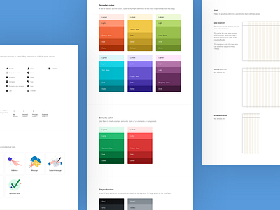
Lead Generation Style Guide
Leadiro is an online product which gives you 24/7 access to millions of B2B data records connecting you directly to decision-makers.
I was involved in redesigning the entire web app and improve the overall look and feel. The key aspects to focus were to smoothly on-board new customers, all the while making sure the current ones stay happy and satisfied.
In the SaaS industry, it's already known by now that: To acquire a new customer costs more than to retain one. Leadiro and I were aware of that fact, so my main focus was to make sure the redesign is tailored to lower the churn-rate and keep it that way.
The lead generation niche is such that the online products offered to the market are packed with tons of features, which is considered their strength in the sales cycle. But we took a different approach. We focused on shipping an MVP with only core features included; features that are known to be essential and business-viable for a lead generation to contain.
By applying a Pareto Principle mentality, Steve and I stripped down everything non-essential, that was not giving the same ROI as the essential functionalities being the back-bone of the app. By stripping down the extras, we stripped-down technical debt, maintenance cost, and potential creeping bugs in some weird corner of the app. Lowering the cost of the above can indirectly increase the revenue. And this is how product design can help in that direction.
I was thrilled to work on such a project. I discovered how big this market is, what are the repeating UX challenges, and also what is the single most qualitative differentiator for such a business to either fail or thrive.
———
Want to solve a similar challenge in your business?
Perhaps I can help. 🙋♂️ Write me.


