Heavy Machine Website Design
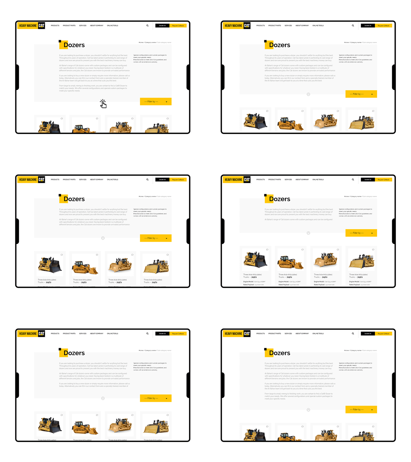
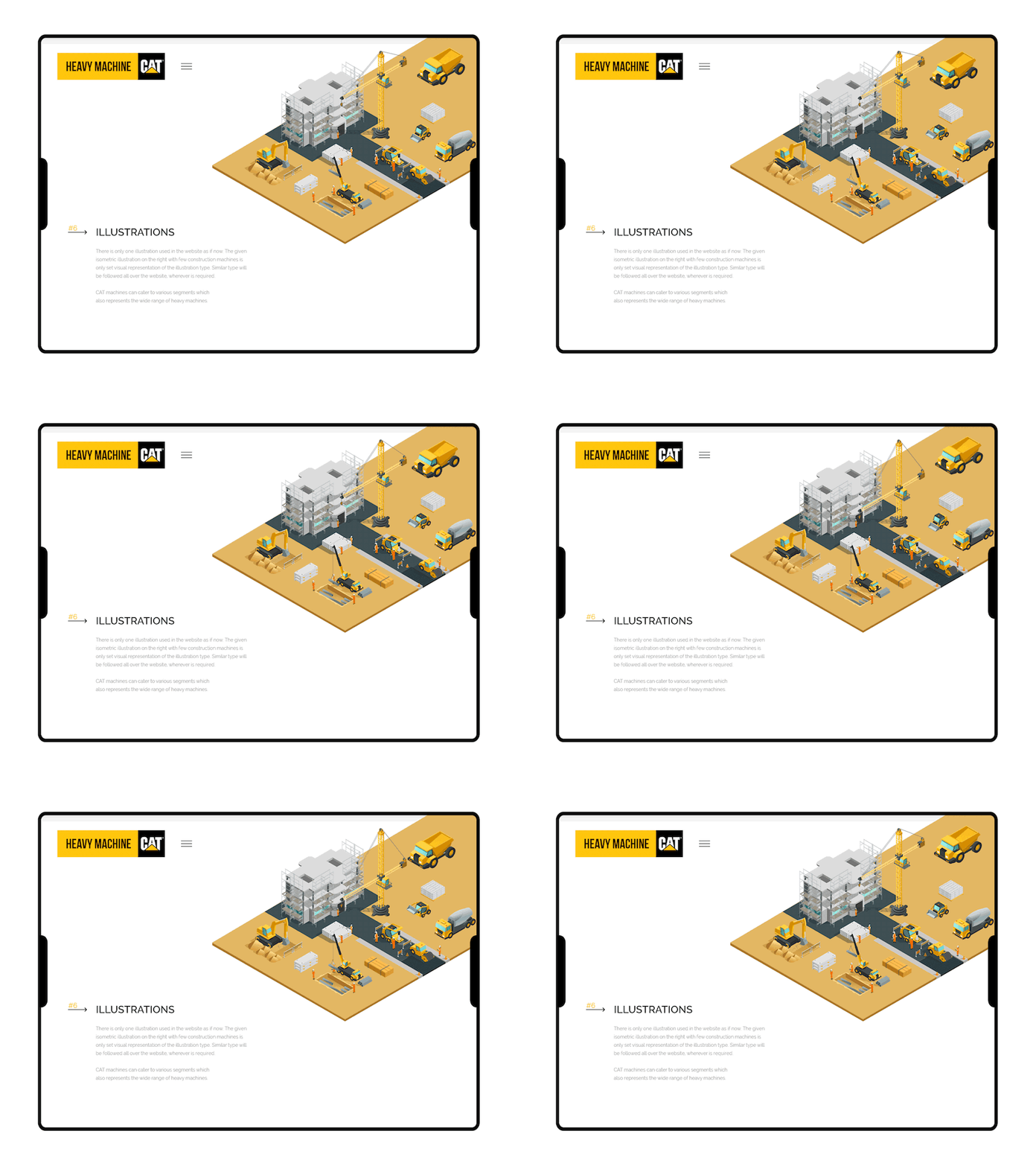
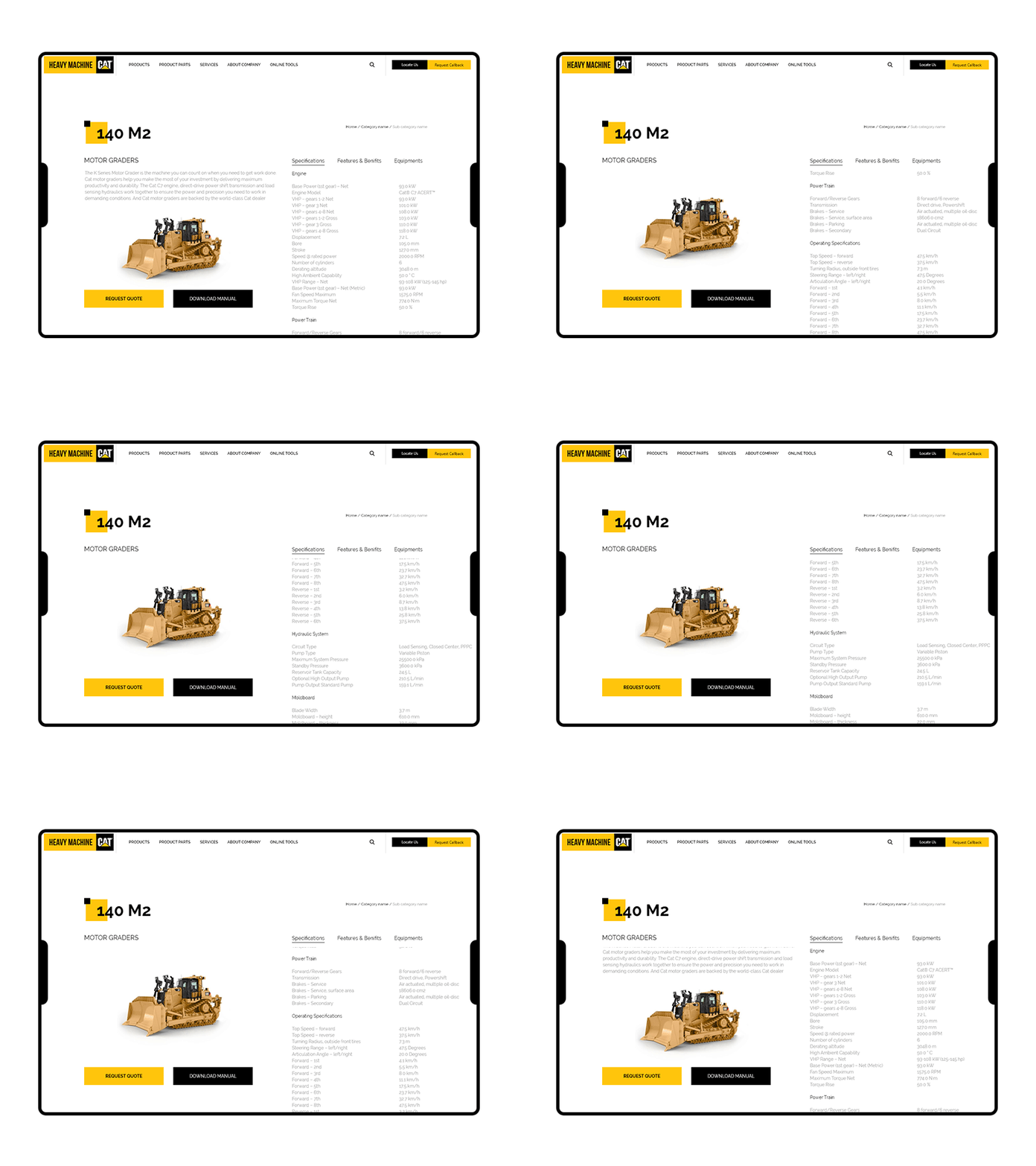
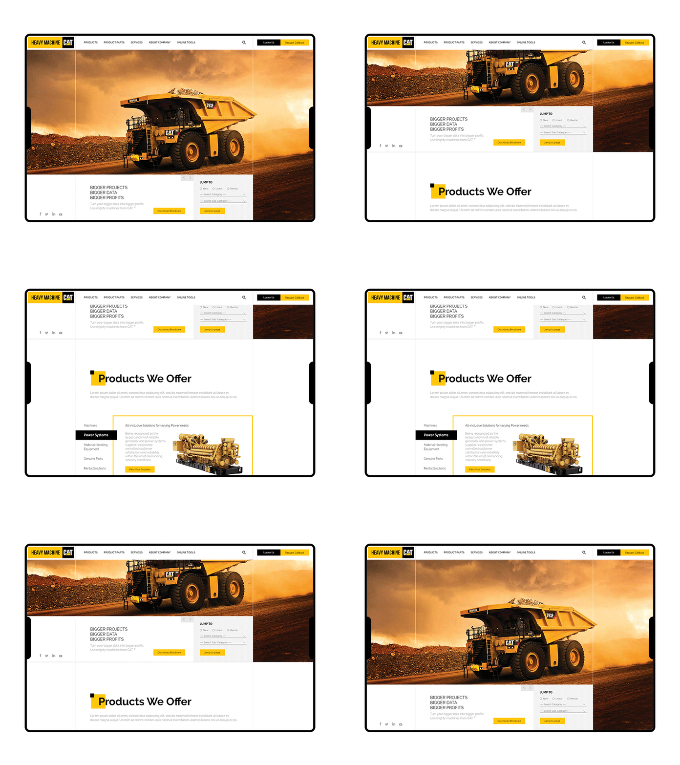
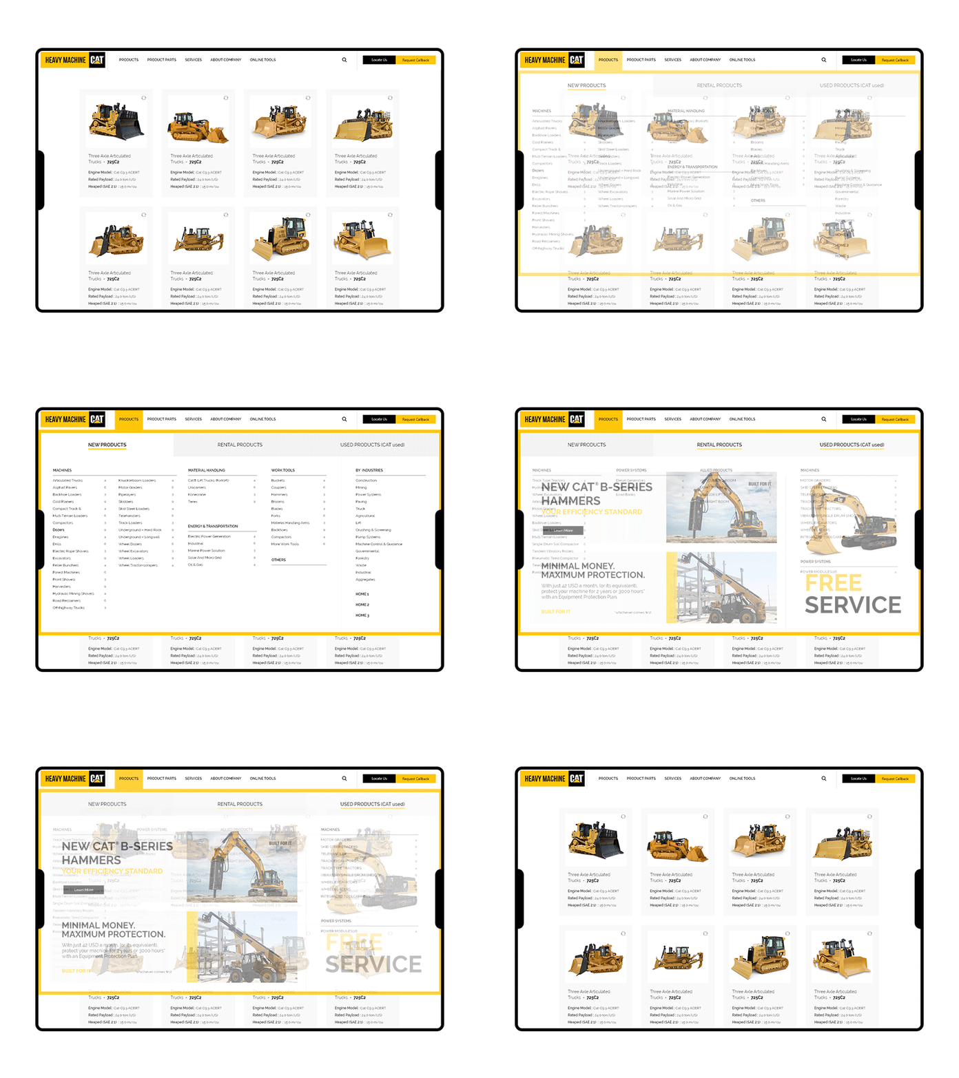
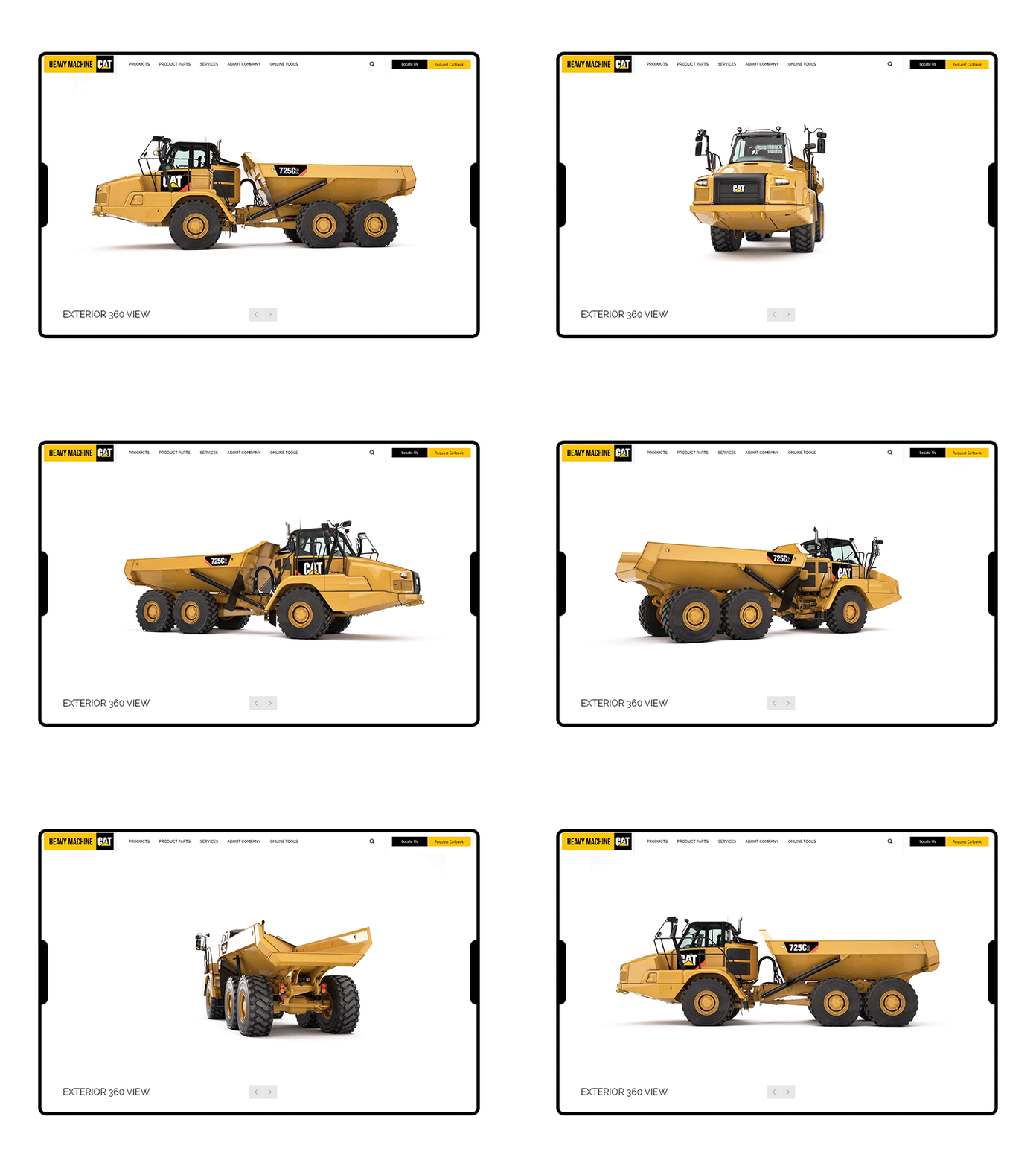
We loved working on this one. We had to show a great amount of information while keeping the website minimal and attractive. Initially it looked like a lot but by following a standard designer process we were able to create great usability and wow our client. We did a lot of research and noticed a trend of dark mode and high resolution images and we started with that only but after several user interviews we realised that dark mode won't work in our use case so with decided to go with light mode and focused on making it clutter free and interactive. Eventually after multiple revisions we were able to come up with the design you see now. It effectively shows a huge amount of information while keeping the website light mood, saving visitors from feeling overwhelmed and staying engages because of the interactive nature of the website.
We've a slightly more detailed presentation of the project on behance - https://www.behance.net/gallery/90435121/CAT-Machines-UI-Design
Like our work? Drop a like and comment. Tell us how we can improve this.
Have a project for us? Drop us an email on design@calypsu.com


