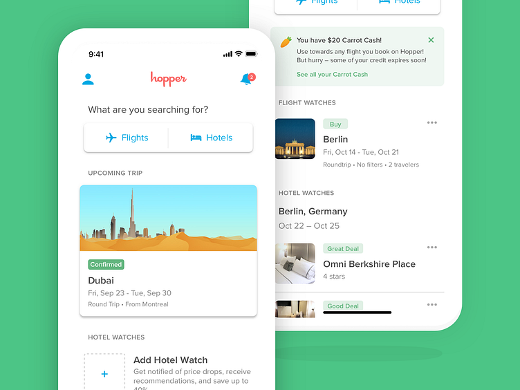
Home Screen
Hopper's search behavior is based on the action of watching a trip. Our users are doing this in order to remove the anxiety that comes with finding when is the right time to buy the plane ticket they are seeking for.
Once a watch is set up, we discovered that those users were passing through 3 different flows to check the latest status of their watch.
What started from a Design Sprint initiative led us to a redesign of our app navigation in an effort to ease the process of checking what's relevant to the users, regardless of where they are within their journey. With this new home screen, our users are always one tap away from launching a new search, checking an active watch, or reviewing their upcoming booked trip!
More by Hopper View profile
Like
