HOM Books / Branding


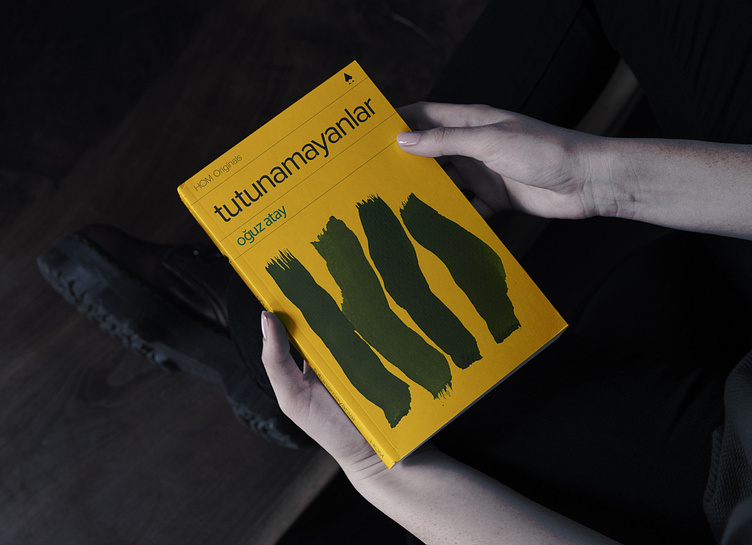


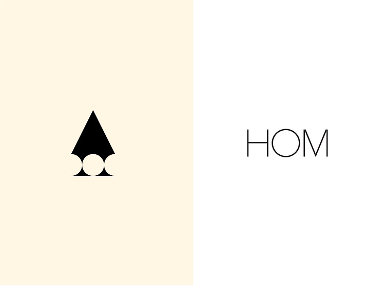


HOM Books is a publishing house brand that aims to publish series of literary works in their original language. I was firstly asked to come up with a title for the brand. I named it HOM to be a reminiscent of the concept "home", since the books will be printed in author's original language, author's own home.
I designed a logotype, a logomark and a book cover layout for the brand. For all the typographic elements in my design, I used the legendary type family Proxima Nova. It is a quite elegant and a versatile typeface, which easily coheres with my visual objectives.
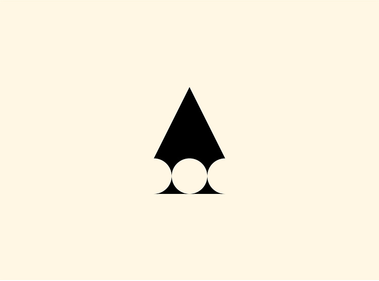
I studied the logomark as a simple and geometric pen tip icon which also reminds of the shape of a gable roof, in order to create a visual connotation for the "home" concept.
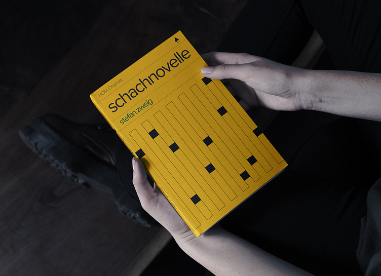
HOM Books is a publishing house brand that aims to publish series of literary works in their original language. I was firstly asked to come up with a title for the brand. I named it HOM to be a reminiscent of the concept "home", since the books will be printed in author's original language, author's own home.
I designed a logotype, a logomark and a book cover layout for the brand. For all the typographic elements in my design, I used the legendary type family Proxima Nova. It is a quite elegant and a versatile typeface, which easily coheres with my visual objectives.
I studied the logomark as a simple and geometric pen tip icon which also reminds of the shape of a gable roof, in order to create a visual connotation for the "home" concept.
