/ The Zen of Beauty


/ Objective To create a new brand identity for Muji and make the brand more unique and clean. This will expand their target audience through a focus on their lines of skincare.
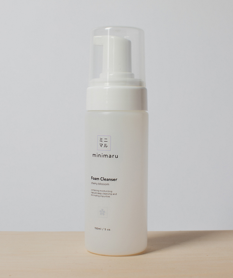
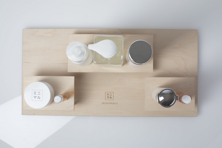
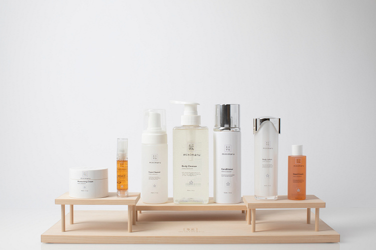
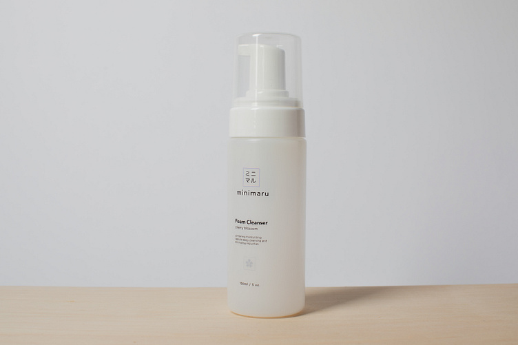
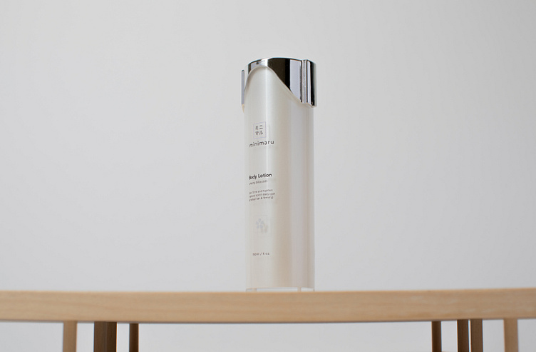
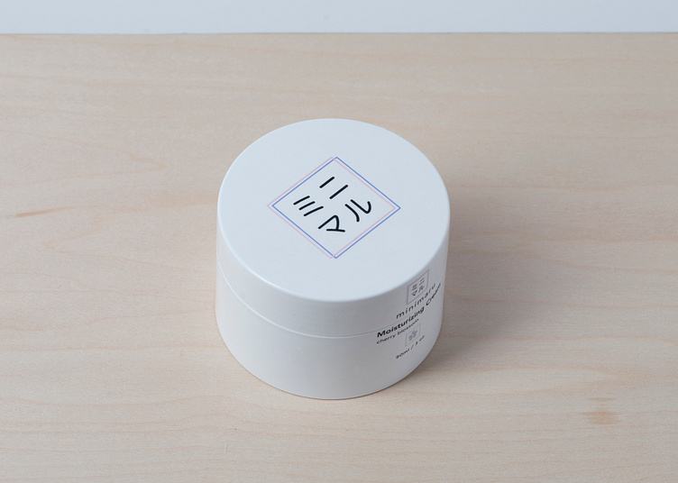
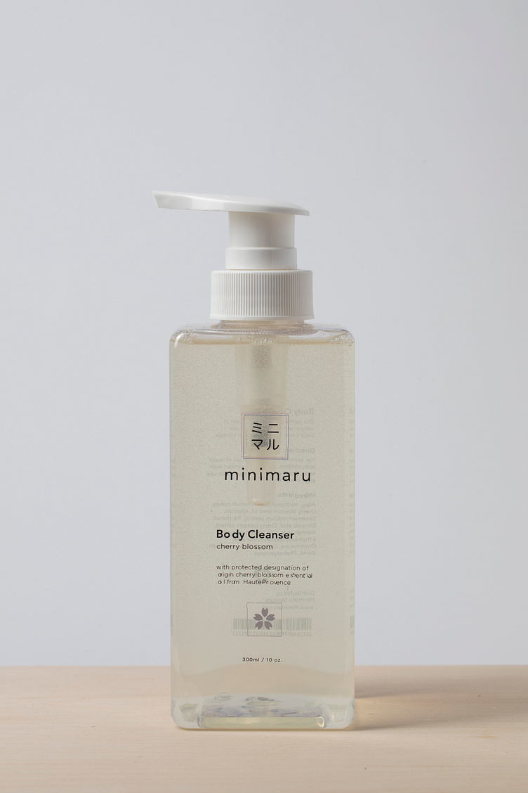
/ Approach The target audience is women from 24 to 32. They demand that products should be simple with a minimalistic package design. The design for the skincare uses elements that are mixed with Japanese culture. The Japanese think that symbol of simplicity is the square. So, the logo reflects this. It uses Kanji characters that mean “minimal,” and Minimaru comes from the pronunciation of those characters.
/ Objective To create a new brand identity for Muji and make the brand more unique and clean. This will expand their target audience through a focus on their lines of skincare.
/ Approach The target audience is women from 24 to 32. They demand that products should be simple with a minimalistic package design. The design for the skincare uses elements that are mixed with Japanese culture. The Japanese think that symbol of simplicity is the square. So, the logo reflects this. It uses Kanji characters that mean “minimal,” and Minimaru comes from the pronunciation of those characters.
