Rainmaking - Grid System


Just sharing some gird and spacing guidelines from the Rainmaking project.
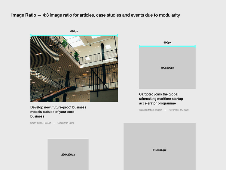
For Rainmaking we used a 1280px grid with 70px columns and 40px gutter. This results in mathematically precise column sizes. 620px for 1/2, 400px for 1/3, etc.
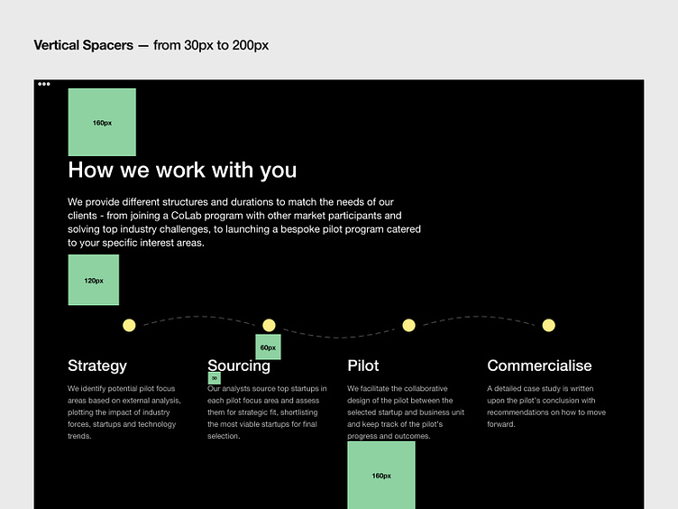
We always strive to define 5-10 vertical spacers (for websites). So when aligning content, modules, and sections vertically - we follow these guides.
Most used vertical spacers for Rainmaking website were:
160px, 120px, 100px, 80px, 200px, 60px ...
For Rainmaking, in particular, we tried to use 160px vertical spacers between all the sections, and i think we managed to do that in 90% of cases across the whole website.
All the best, Filip