Logo redesign for HootBoard
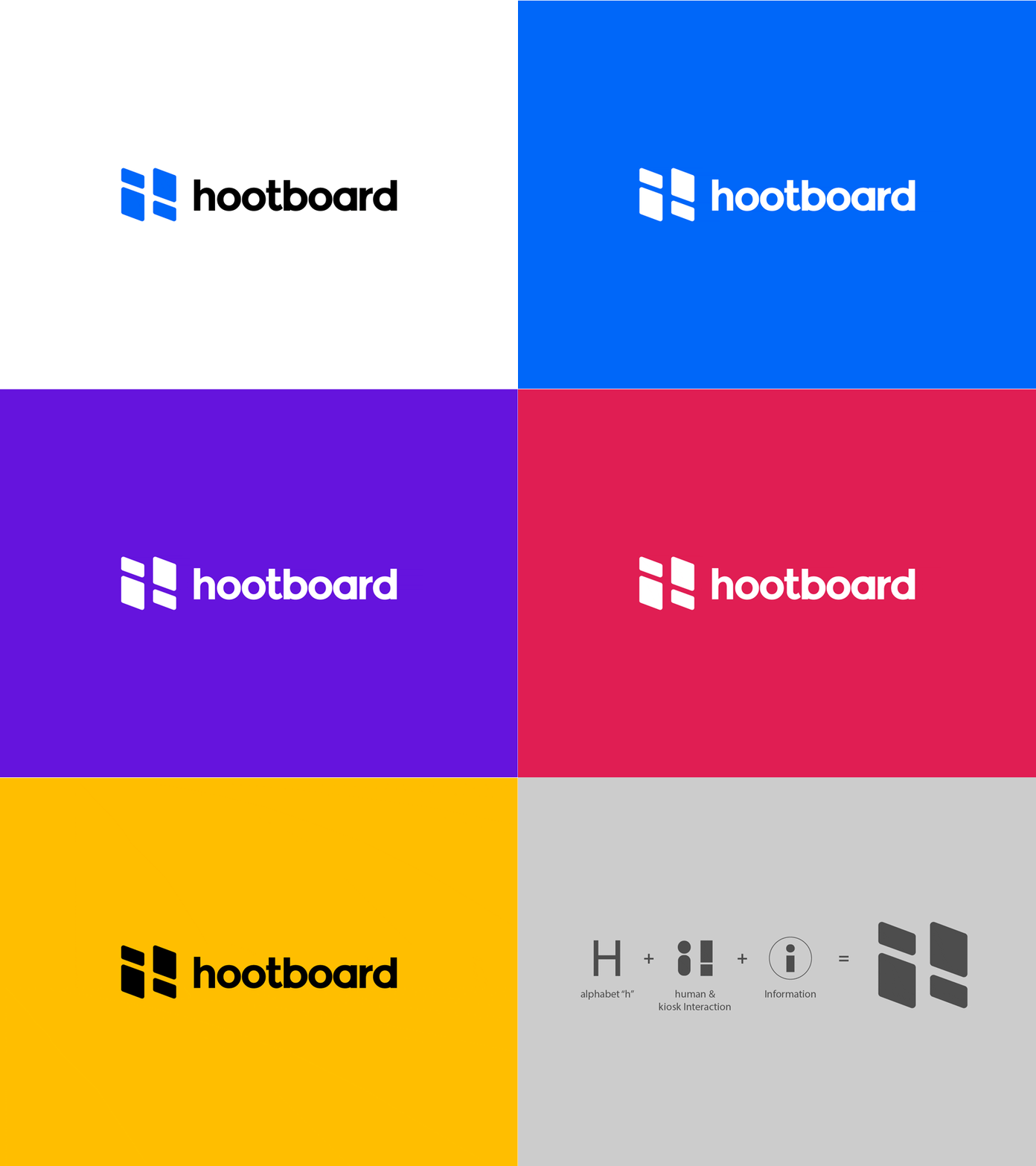
Redesigned the HootBoard logo into a simpler, memorable and modern version. The older logo was designed in 2012 by me but it was too busy and clunky.
HootBoard is Kiosk based platform software so the idea behind the logo was letter "H", information "i" and most importantly showing interaction between a person and the kiosk.
So, the logomark is created in such a way that it represents a person (on left) interacting with a kiosk (on right) forming letter "H". It also forms two "i" one of them is inverted to represent information. Also, the logotype was custom created as well.
More to come from this project :)
For more info visit:
https://www.hootboard.com/
More by Abhishek Bbundhu View profile
Like
