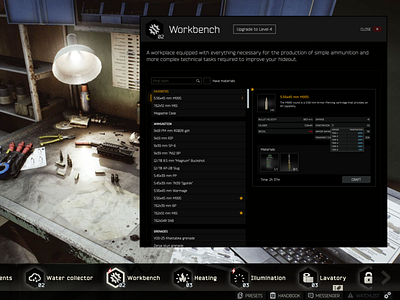
Escape from Tarkov - Workbench
Escape from Tarkov's UI is a little outdated. This is an attempt at updating the look and feel.
Currently the workbench is a bit odd to use. Center aligned items in a list make it hard for the user to read items fluidly, they are looking left and right as the item expands accordingly. By condensing this view into a list on the left and a preview on the right after an item has been clicked we can save space and allow for easier navigation. Also, by splitting items into categories we can allow for easier navigation. Additionally, allowing the user to mark items as favorites will allow for even easier use. Finally, adding functionality (checkbox) to only see craftable items that you have the materials to craft currently will aid in user experience.
Fullscreen for full view.
