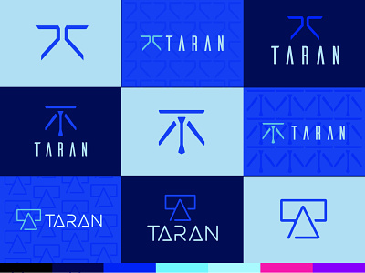
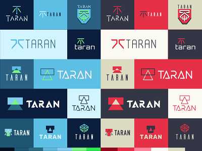
Taran Armstrong Logosheet 3
Narrowing down and refining the logo mark and typography. We settled in on three glyphs and two typefaces while punching up the blue into the neon realm.
It's starting to really feel like I'm looking at logos for a big corporation about to launch some world-changing/ending technology.
More by Harlan Elam View profile
Like

