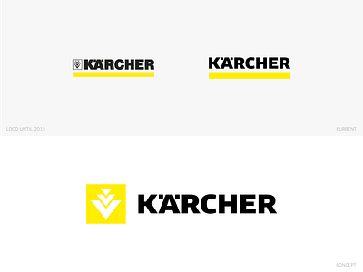
Kärcher redesign concept
I decided to give it a try and create my version of the Kärcher logo
—
The last redesign of the logo was done in 2015. Here a new font was used (FF Clan Pro), which also serves as the corporate font.
I wanted to keep the font and actually only increased the spacing between K and Ä.
With the redesign, the symbol was also removed, but it is still partially used.
Therefore I wanted to rework this symbol and include it in the logo again.
—
What do you think?
— —
Feedback is always welcome
————————————
Looking for a logo design?
DM or Email me: hello@daniel-rotter.de
————————————
Need a pre-made and production-ready Logo?
Check out my Logo-Store!
————————————
www.differencemedia.de
————————————
Links:
Instagram | Linkedin | Behance

