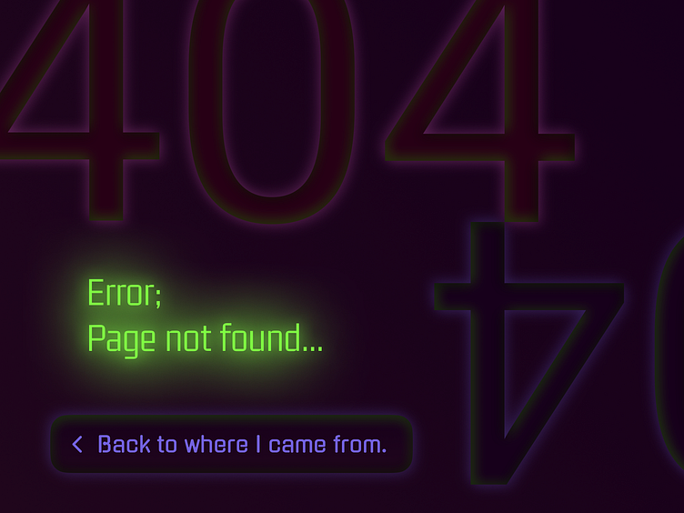
DailyUI - Day 8 - 404 Page
For the 8th day of the daily UI challenge, I had to design a 404 error page. I think the best 404's take an element of the website's concept or functionality, and then appropriate it for the 404 page. Like how figma does it: https://www.figma.com/404/ They offer their design tool-functionality within their error page, so you can play around with the characters. It makes the 404 less serious and boring, and instead more playful. You almost ' unlocked' something special.
However, for this approach a context is needed, something to appropriate. And for this exercise, I had none. Therefore I decided to go try a different approach: to try out something weird. So I combined a dark UI with some neon glows. I am not sure if this experiment really works. Curious what people think about it and how I should improve the design.
