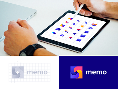
MEMO Logo Concept
Hey Dribbblers, please meet our new project - branding for MEMO education
An educational platform that teaches design and IT industry skills to creative young people who are striving for more and willing to invest their resources in themselves and their development.
Our objective, apart from distinguishing the platform from its competitors, was to portray care, support and communication between teachers and their students, building trust and fostering a positive user experience.
The memo platform utilizes the approach of maximum interaction between a teacher and student. It is this relationship and support that formed the basis of our team’s work on the branding.
Our team is very thorough and careful in selecting the colors. Balanced, bright, bold and chosen with regard to the cognitive patterns of color perception. These are the qualities that affect the user, drawing them in and expressing the essence of the brand.
Robust and comprehensive branding includes the development of full specifications on logo use, the necessary fonts, primary and auxiliary colors, and more—everything that is necessary for proper and easy brand use to accomplish the brand’s number one goal: be memorable, be distinct, be successful.
As a result of the memo project, we have a full business development package: branding that includes the logo, typography and color palette, a website redesigned for better UX and an upgraded UI in line with the newly created brand book.
Results:
34 - sketches developed
223 - positive feedbacks during proof of concept
60 - icons in the custom set designed
6 - team members worked on the project
More details and how we approached every step is described on this page: https://www.outcrowd.io/memo
***
Chat with us, just sending us a note hello@outcrowd.io
Be a part of our creator’s community at:
Medium | Instagram | Twitter

