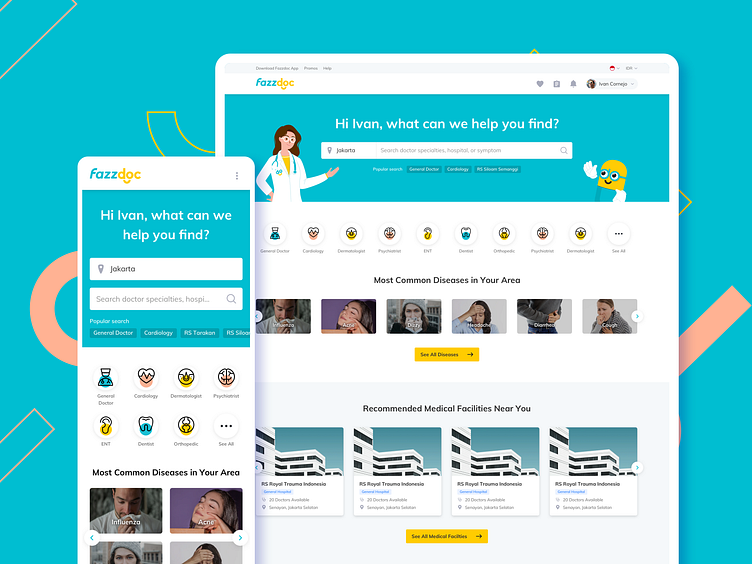
Fazzdoc Responsive Homepage
Here's a look of Fazzdoc Responsive Homepage.
The main idea of this page is Content Prioritization. Instead of cramming all of the content into mobile, we organized them without sacrificing its usability. For example, we put the objects from the header into an overflow menu. So the user will find them collectively much like the desktop version.
More by Flolab View profile
Like
