Sairento VR HUD Concept

A quick concept for a heads-up display (HUD) for the cyberninja action game Sairento VR. While I studied VR for my doctoral dissertation, the one thing that bothered me was how certain pieces of information were portrayed within VR. Traditional HUDs would generally break immersion, while some VR games would place important pieces of information on your wrist (e.g. Fallout 4 VR, Arizona Sunshine), other games that used a helmet-based HUD often had too much informaion that obstructed the main game world.
Personally, I believe the helmet-esque HUD styles are the best kind for modern VR, as physical headsets like the Valve Index, Oculus Rift, and HTC Vive all have a bit of weight to them. By considering the physical constraints of VR, a relatively minor inclusion like a helmet-based HUD could help to further the overall immersion of the VR world.
With that said, I took some inspiration from basic augmented reality (AR) UI principles: an overlay should be passively present, but reactive to the environment and situations around it. In short, it needs to be able to convey necessary information with as minimal a presence as possible. While it's difficult to convey VR elements in 2D space, I focused on visualizing the general layout and positioning of each HUD element on the screen.
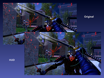
Horizontal compasses have been pretty standard in games for years now (e.g. Fortnite, Assassin's Creed, etc.), and its general design lends ittself well for a HUD. It takes far less visual space than a traditional circle compass, as well as being able to act as a map of sorts to direct players to an objective. The compass was also placed towards the top, which would be out of the way under normal circumstances, but quickly accessible if the player glances upwards. In the center are 2 gauges; health on the right, and a skill timer to the left. While it may not be immediately apparent from the screenshot alone, these gauges would ideally be introduced during some sort of tutorial section, and the order of these gauges also follow in the footsteps of games like Goldeneye 007. Furthermore, the gauges are positioned in an area that's near the player's periphery to give the player a much clearer view of the main action. Naturally, to make a much better experience and accommodate everyone's point of view, these elements should be moveable and scalable.
While modern VR has been out for over 3 years, there's still quite a lot of work that can be done to improve the overall UX. What do you think of my design, and how would you create your own VR HUD?