Hutton’s


DESIGN
Mr. Hutton lived across the street from my parents. He lived to be 95, and he was one of the most generous people you could ever meet. He had two gardens; a flower garden in his yard, and a vegetable garden in a plot somewhere in town. He gave away a lot of what he grew.
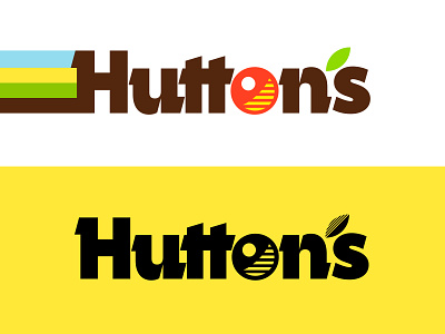
Logo: I was trying to think of something that was unusual, and I wanted to see if I could design a logo without overt references to food and farms—baskets of produce, etc. I love working with type, and given my constraints, a wordmark seemed like the clear way to go.
Typography: That's Campora. I've wanted to use it on something for a while. It's solid, warm, and kind of quirky—much as I remember Mr. Hutton himself.
Color scheme: I was thinking of a field when I did the four-stripe pattern: soil, greenery, crops, and sky.
SLIDES
1 and 2: Logo concepts.
3: Signage for the different sections of the supermarket.
4: CashCard. I thought a lot about this one. I kept worrying that it needed more—clever references to money, something fancier, something cuter—but I just couldn't get away from the simplicity of the colored stripes and the logo. Finally I decided that the simple design, even if it risked being a bit mundane, still captured what I was going for better than anything more developed.
5: How the logo might be used on packaging. I was imagining a buffet-style lunch takeout service.
6: The "cherry" and "leaf": Elements to convey freshness.
7: How the typography could work in an ad.
8: Stuff that didn't make it. The Hutton's Farmer (a mascot? logo? who knows?); various leaf patterns that felt too mechanical; and a couple of logo concepts that didn't work out.