Google Pixel Concept
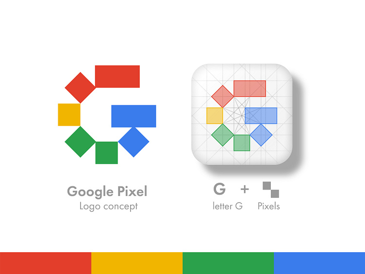


Logo concept for Google Pixel!
This concept uses uniform square shapes to create the shape of a G. I like the way it resembles pixels, however puts a twist on that theme by arranging them at non perpendicular angles. The individual pieces creates the opportunity for each section to take on the different colors in the existing logo.
Let me know your thoughts in the comments below! 👇
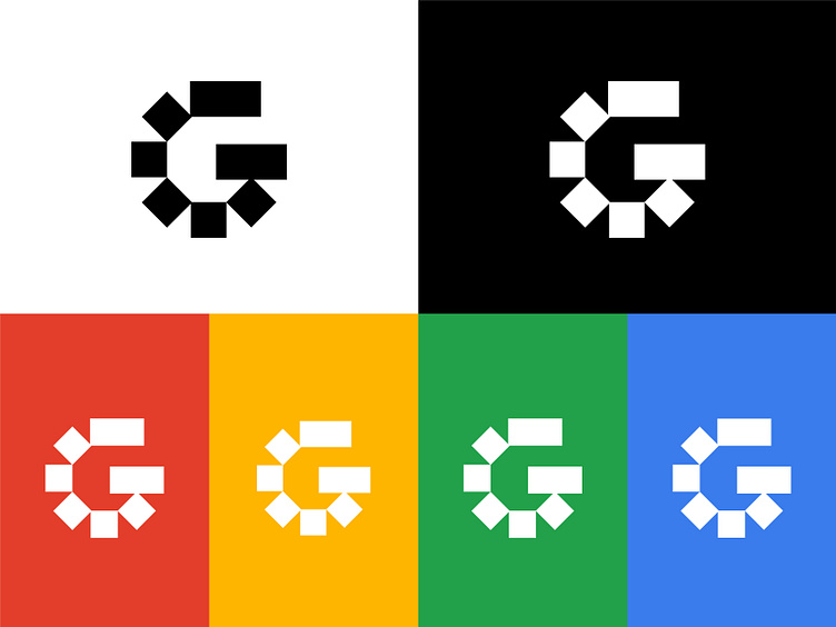
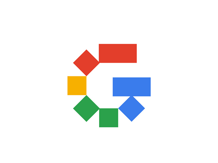
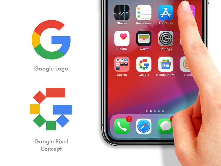