Geoangular Script
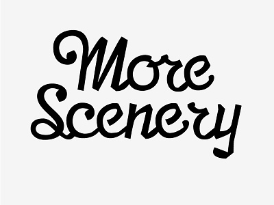
This is my attempt at a geometric script, with a pinch of the angular thrown in, as well as a little tiny bit of stroke contrast. I'm trying not to be too informed by the natural pen stroke. Anyway, it's part of the titling for a tiny little magazine I'm working on.
The cap M is probably too dark? Especially the far right down-stroke. And the "o" is a disaster. I hate "o"s.
As with all things like this, I started with a bunch of ideas and am now gradually refining out the quirks. The thing is, I still want the quirks as it's to be used for the title, and not as a font per-se. Although maybe it will become a font in a million years.
I welcome feedback of all kind!
