Linkedin (Subtle redesign) Concept
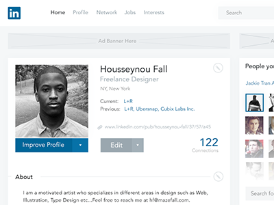

I use Linkedin everyday and the one thing that keeps bugging me is the overall aesthetic of the site. The background seems old and dry.
Top Nav is too dark and distracting. The typography isn't legible enough and last but not least, you don't get the sense of Linkedin's brand anywhere on the site.
What I did:
I kept the same layout grid (the only thing that looks right on the site) and its content structure.
I chose Avenir as the general font and implemented Linkedin's color throughout the site and have also messed around with different shades of blue for links, background and buttons.
Overall, My intention was to give Linkedin the vibrant, minimal feel that it deserves and at the same time maintain its professional vibe.
Let me know what you guys think.
View Attachment for bigger view.
My Linkedin: www.linkedin.com/pub/housseynou-fall/37/57/a45/
Twitter: https://twitter.com/HousseynouFall
