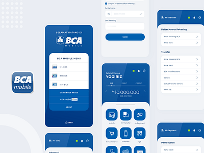
BCA Mobile Redesign
BCA (Bank Central Asia) is one of the largest companies in Indonesia, Asia. Many users say the BCA mobile app has a good user experience, is easy to use, but has a bad user interface compared to other bank apps.
So, I tried to redesign the app without making a big difference UX like the original one.
I wrote my own "UI / UX Case Study" too about this in Bahasa Indonesian.
Here: https://medium.com/@yogiriz/ui-ux-case-study-bca-m-banking-e09ea5526a79
Let me know your opinion about my redesign, any feedback is very appreciate. Cheers! :)
More by Yogiriz View profile
Like
