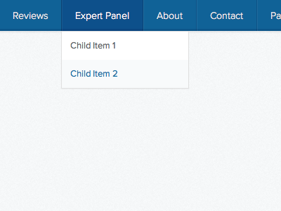
Simple Navigation States (CSS)
Hope you're all having a great Friday!
I recently started to develop my design for the Simple Marketing Plan website (more shots of the design coming soon) and I'm really pleased with how the menu has turned out in pure CSS.
Oddly enough, playing with all of the shadows, borders and transparent backgrounds to get it to look right, and exactly like the Photoshop design, is much harder than it looks.
The shot is showing the hovered/active parent menu item, with a dropdown containing two child items - one of which is also in the hover/active state.
More by Luke Etheridge (Proud Designs) View profile
Like
