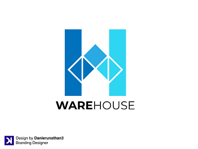
WareHouse
My idea in this logo is to use a letter, namely H and W. The outline forms the letter H then the upper indentation forms the letter W and the bottom forms the negative space of the house.
~
Follow my Instagram :
https://www.instagram.com/danierunathan3/?hl=id
~
Follow my Behance :
https://www.behance.net/danierunathan3
~
Want Logo for Your Brand?
Email Me :
danierunathan3@gmail.com
THANK YOU
More by Daniel Nathan View profile
Like
