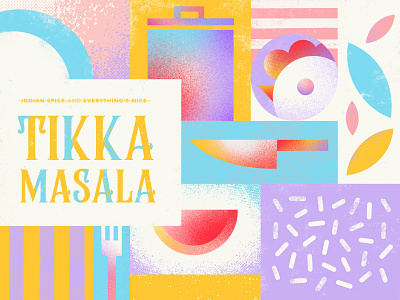
Tikka Masala - Playful & fresh bottle label design
I love to eat and also going to restaurants. Especially for my lunch breaks where I'm regularly trying out new stuff and exotic food.
-
Being stuck in Home Office means a lot of planning and cooking on my own which challenges me sometimes. So I just love sauces that can be mixed with fresh veggies, tofu or meat and that instantly make my meal a lot more interesting.
-
That's why I designed a fun and fresh bottel label for a "Tikka Masala" sauce. It's one of my favourites and I recently found out that is was voted "Favourite dish" in the UK in 2001. The look of these bottles is mostly traditional or "exotioc" in a way that it features typical indian patterns or pictures of food. I went in a different direction and landed on pastel colours and a lot of illustrative graphic elements.
-
So would you grab this one if you saw it in the supermarket? Let me know what you think.

