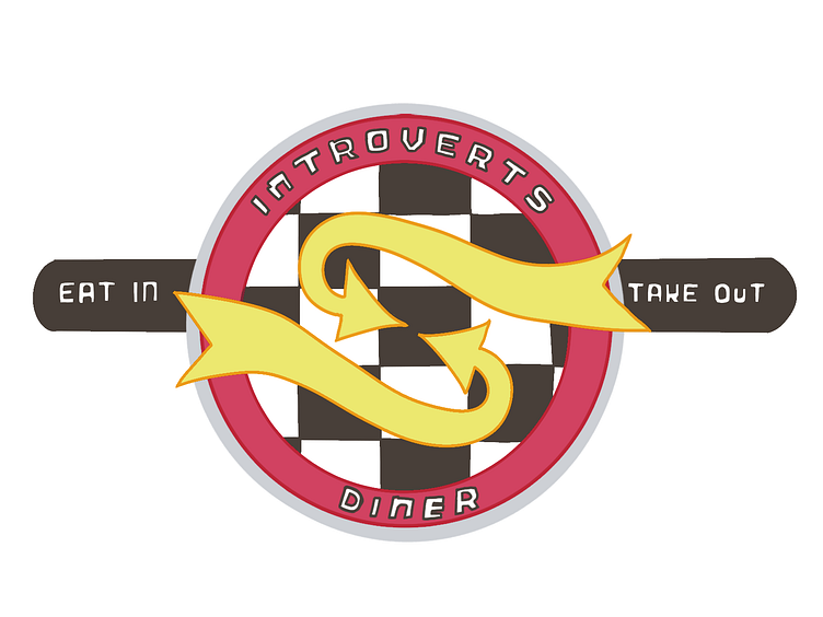
Introverts Diner Logo
A few years ago I took a digital art class the summer after my college graduation. One of the assignments of that class was to create a fake business and create a brand standard for it. Part of doing that was creating a logo. After seeing it again in my files today. I decided to redo that logo. The previous version used a lot of gradients in order to get a chrome look for a diner. In this version, I went with flatter colors, got rid of the use of black in exchange for a dark brown. While this version isn't perfect, I feel more satisfied with the end result than the previous one.
More by Ashley Seal View profile
Like
