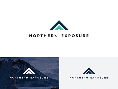
Marketing Agency Logo Design
Part 2. The second version of the logo. First one you can check on my profile right next to this one. You can't miss it!
Just recently, I've been working on a logo design for a marketing agency called Northern Exposure.
The brief included some examples of logos that client liked along with a description that said that he liked minimalistic design and that he sees his logo indicating to mountains as a main inspiration.
This one was based on the same concept of growth, exposure, going north/up. Thus the arrows. But this time I wanted more elegant feel to it. It kind of reflects as a bit corporate.
The typography part is my favourite here! It shows boldness, accuracy, stability and the colors support that feel. I'm really proud of this one!
Let me know what you guys think about this one!
