Jolocom collateral • New whitepaper
Last year we created a lot of branded collateral for Jolocom — from big& bold to small&viral. It’s time to bring them all under one umbrella as a new design case study.
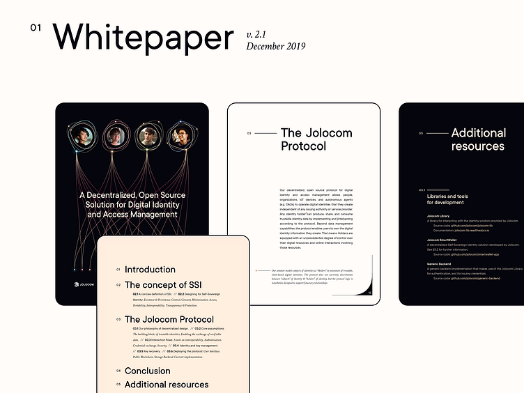
Today sharing a shot of the boldest among them — also most important for every deep tech startup — our new whitepaper that we released last December.
While designing the layout we made several interesting decisions: - chose iPad format over A4 (as most of tech whitepapers) or screen horizontal (as many reports); - shifted the page color from white (or light grey alternative) to ivory; - played around with pagination to finally merge it with the potentially black device, not having it as a page layout element.
You can download the whitepaper here. (will also learn a lot about the new digital identity :D)