Daily UI / UX - 007
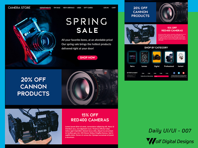
Today's entry is a continuation of post 006, and it follows the complete landing page for a camera store. I decided to keep using the colors from the hero image as a theme, including subsections of the page that contains boxes colored in one of two colors (blue / carnation) and the images next to them have color overlays of the other color.
In addition, I employed a subtle blue shado to surround the images that represent each category on this website. There is a footer that follows the same color and typography scheme and helps create the idea one page. I will say I have gotten inspired recently by "dark" mode on iOS and other platforms, so I wanted to emulate a landing page with somewhat similar feel.
If you like what you see, please show some love by hitting "L", and/or provide any constructive feedback! ❤️