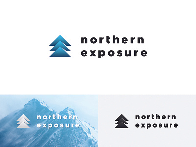
Marketing Agency Logo Design
Just recently, I've been working on a logo design for a marketing agency called Northern Exposure.
The brief included some examples of logos that client liked along with a description that said that he liked minimalistic design and that he sees his logo indicating to mountains as a main inspiration.
Combining triangles and arrows that indicated both 'north' and 'exposure' I came up with this symbol followed with bold typography that shows strength and audacity. I love how it came out!
What do you guys think?
P.S. This is the first solution. Can't wait to show you the second one!
More by Nemanja View profile
Like
