Foods USA Website
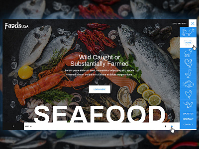
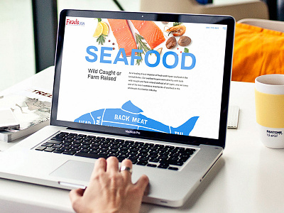
Last year I worked with the wonderful people at Foods USA to beef up their internet footprint by designing a new website.
The biggest hurdle they challenged was a simple to navigate and understand website. Their current version was antiquated and outdated. To make matters worse it was very difficult to find the information you needed. Something no website should face. So the requirement was simple, list the various categories of meat they ship, specific types, provide an easy way to request orders and inform the customers on the basic who, what, when and where. Simplicity was key.
More by Aaron View profile
Like


