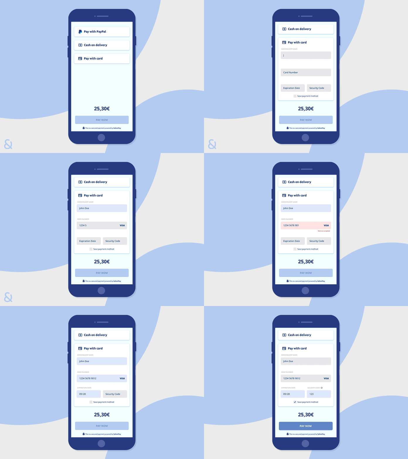
Daily UI Challenge #2 - Credit card checkout form
When I fill out a form, as a user, I expect to be hand-guided through the content that needs to be filled in and to have clear feedback about the correct or incorrect outcome, especially if I am entering sensitive information such as credit card data. For this exercise I did my best to create a clean and understandable form, even at first glance.
More by Eleonora Preziosi View profile
Like
