PrimeRose
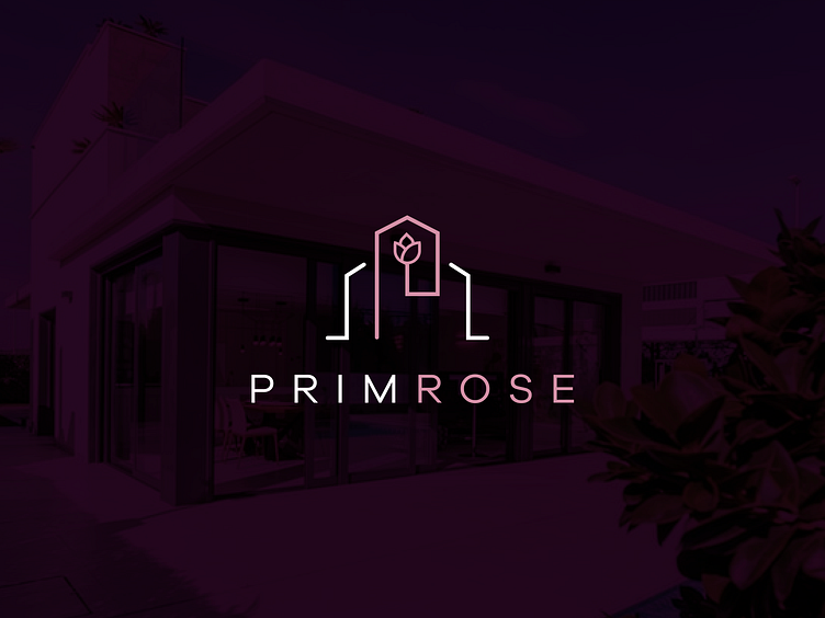
A unique and clever logo for a high-end Real Estate company in the North American market. We shot two birds with one stone and showed an interesting mix of brand initial P and a rose flower. Two additional lines on the sides help it form the shape of a house that relates to real estate. The icon gives an easy hint about the brand's nature and the particular set of services. For the name, we have picked an eloquent font that becomes another strong point. The logo design, as a whole, speaks about comfort and quality and invites the ideal customers to connect with the brand.
_____________________________
Press “L” to show some ❤️
Are you looking for a logo (re)design for your business? I’d be happy to hear your story! Feel free to reach out!