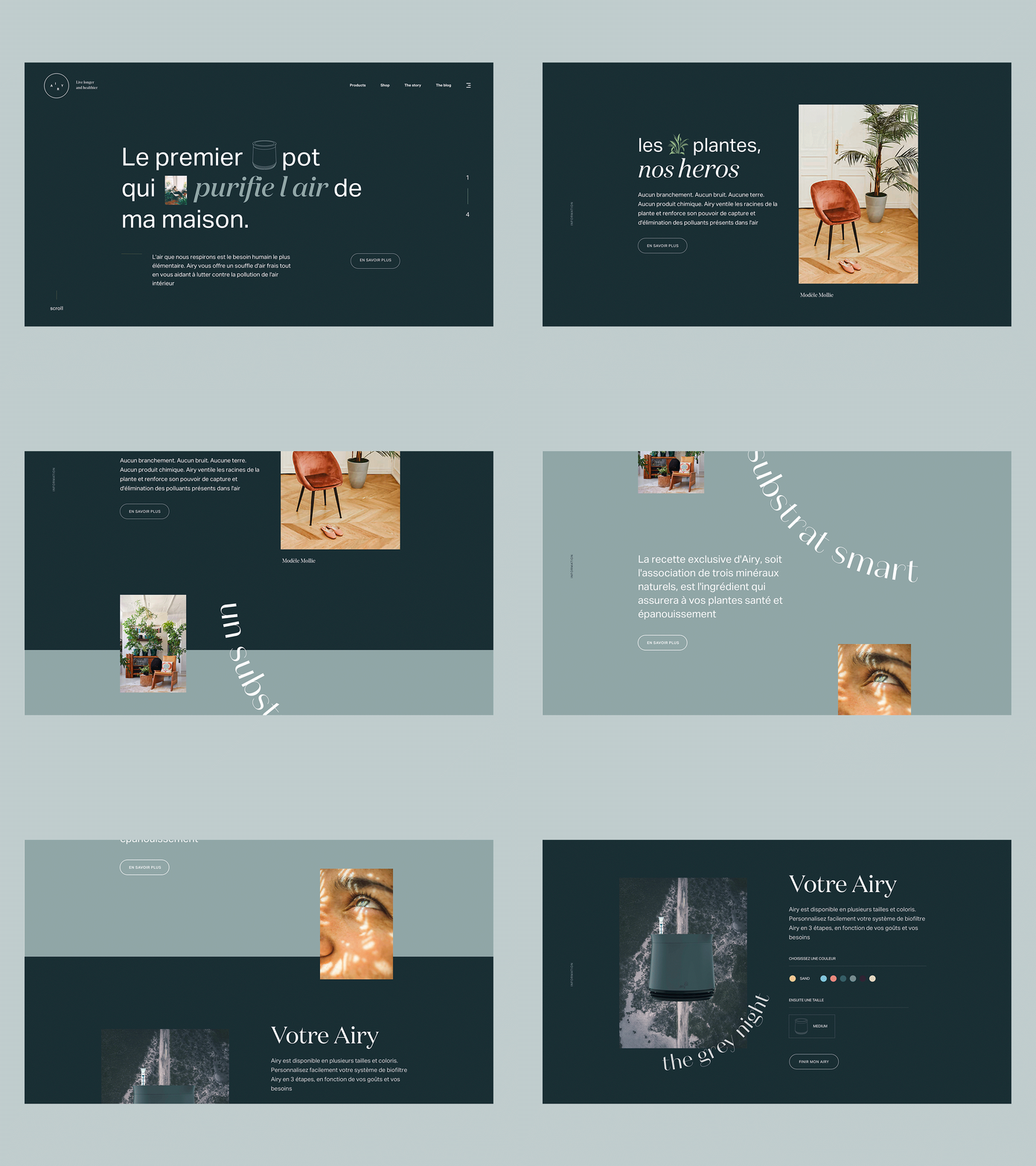
Minimal Homepage Design for a ecommerce
Hey,
Here are some new screens from the homepage made a few weeks ago for a great Airy product. A very minimal homepage that plays with color and typography. A slight parallax brings the reading dynamics to the scroll.
I'm trying to put more regular work in progress on my Instagram, look forward to seeing you there.
👉 https://www.instagram.com/hbnpierre/
👋 Available for freelance/remote projects in Art Direction, Product Design and User Interfaces.
See you !
More by Pierre Hubin View profile
Like
