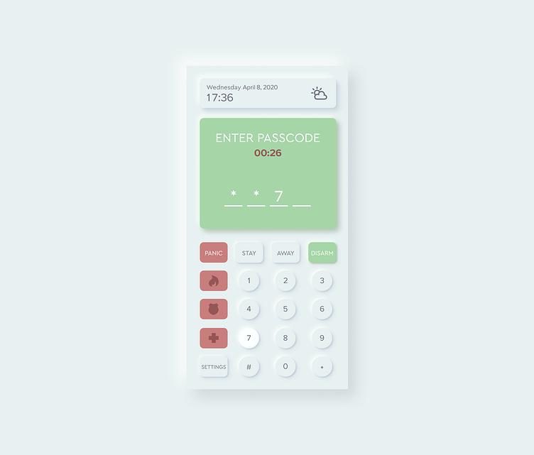
Daily UI 21 Home Monitoring Dashboard
I decided to give neumorphism a try. Instead of a generic home monitoring dashboard, I mocked up an app to control the home alarm system. The emergency buttons are on the left to minimize the chance of accidentally pressing them. Colours didn't hit the spot this time, so maybe I'll keep everything closer in the spectrum/more neutral next time.
Credits to the awesome person who made this tutorial: https://uxplanet.org/neumorphism-in-user-interface-tutorial-c353698ac5c0
More by Alice View profile
Like
