The „Useful” Mobile Mockup? – Library Login Design
„Useful” instead of „fancy”: paying extra attention to make our website mockups more useful.
The websites we design rarely cover the users' whole screens. We should include some of the UI of iOS, Android and / or desktop browsers. It means: any browser headers, but also docks, bottom navigation, and top status bars should be included in our mockups as well.
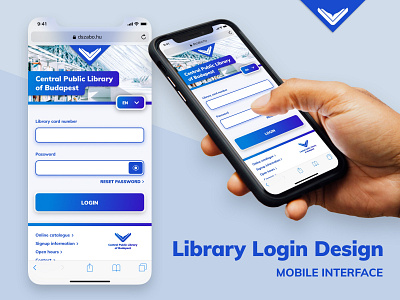
It turns out that these take up a lot of space, so we misjudge not only how much is shown above the fold, but also where the easiest tap targets fall for most users. You can see on this sample mockup that the most important UI elements are in the „touchscreen Goldilock-zone” for your thumb.
These „more realistic” mockups should be the norm, so that when we are working on real products – and not just building our design portfolio – we are not tempted to draw impossible previews for our own team, or for the client.