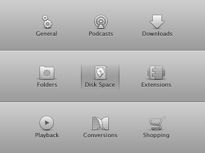
New preference pane icons for Miro (OSX UI icons)
What do you think?
Check out the extensions icon - I meant for it to look like two interlocking pieces with one of them being an extension for which I was able to make into an E. Pretty stoked about that one.
More by Morgan Allan Knutson View profile
Like
