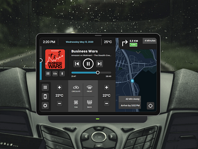
UI Challenge 34: Car Interface - Dark
Challenge #34 for https://www.dailyui.co/
** I flipped the original design into a dark version too, as that is a big consideration for Car UI. It's super important to have an interface that works both in the bright daylight and dark nighttime.
I was very nervous doing this UI because over 7 years ago I did a case study on a car dashboard and the my conclusion back then was touch screens are not the best interface for cars.
Things have changed a bit since then because we are getting closer and closer to autonomous vehicles, but I believe car dash UIs are still a frontier in UX that has not achieved any type of standardization.
That being said, I want to add the disclaimer that I approached this from a pure visual POV and did not spend months looking at all the unique use cases for drivers, something I skimmed so many years ago. I think to truly tackle a Car UI it take such an incredible amount of user research before any visuals can be started.
With all that aside please enjoy this simple Car UI I did for this challenge.
Light Mode: https://dribbble.com/shots/11407859-UI-Challenge-34-Car-Interface
Car Dash Photo: https://unsplash.com/photos/89sXVIkgYnI
UI: Axure RP 9
